

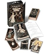
Pictorial Key Tarot
Product ID: 44071152
Buy anything from 5,000+ international stores. One checkout price. No surprise fees. Join 2M+ shoppers on Desertcart.
Desertcart purchases this item on your behalf and handles shipping, customs, and support to KUWAIT.
The vivid illustrations in this stunning deck bring the arcana to life like never before! Experience how these avant-garde realizations of familiar tarot figures and symbols can open your inner temple. The companion booklets for most Lo Scarabeo decks are in five languages: English, Spanish, French, Italian, and German. Review: Beautiful artwork - The artwork is not a copy of Waite's cards possibly due to copyright. If you want the strictly Waite interpretations, you'll have to read his book, also available on desertcart. One interesting change I noticed was in the XVIII Moon card. Waite shows a crustacean coming out of water. Crustaceans are considered to be bottom feeders. Crayfish have been found with pathogens and parasites. Some lobsters suffer from diseases also. Waite says of the crustacean, " It strives to attain manifestation, symbolized by crawling from the abyss of water to land, but as a rule it sinks back whence it came." Earlier he says, "The card represents life of the imagination apart from life of the spirit." The creator of this deck shows instead an ugly creature still in the water and notes in the LWB (little white book) "...Unleash your adventurous spirit, but prepare yourself to face unknown dangers." If you're not worried about some missing or changed symbols from Waite's version, then this is a beautifully executed Pictorial Key to the Tarot Review: Interesting Imaging! - Beautiful color and interesting imaging!! A nice addition to my deck collection! The sturdiness is reasonable, but that’s okay because it makes shuffling easier?! Great deck!


| Best Sellers Rank | #2,115,633 in Books ( See Top 100 in Books ) #3,505 in Tarot |
| Customer Reviews | 4.4 out of 5 stars 127 Reviews |
M**G
Beautiful artwork
The artwork is not a copy of Waite's cards possibly due to copyright. If you want the strictly Waite interpretations, you'll have to read his book, also available on Amazon. One interesting change I noticed was in the XVIII Moon card. Waite shows a crustacean coming out of water. Crustaceans are considered to be bottom feeders. Crayfish have been found with pathogens and parasites. Some lobsters suffer from diseases also. Waite says of the crustacean, " It strives to attain manifestation, symbolized by crawling from the abyss of water to land, but as a rule it sinks back whence it came." Earlier he says, "The card represents life of the imagination apart from life of the spirit." The creator of this deck shows instead an ugly creature still in the water and notes in the LWB (little white book) "...Unleash your adventurous spirit, but prepare yourself to face unknown dangers." If you're not worried about some missing or changed symbols from Waite's version, then this is a beautifully executed Pictorial Key to the Tarot
F**S
Interesting Imaging!
Beautiful color and interesting imaging!! A nice addition to my deck collection! The sturdiness is reasonable, but that’s okay because it makes shuffling easier?! Great deck!
V**1
Pictoral Key Tarot
This is a beautiful deck of Tarot cards. The artwork is amazing. The colors and images really speak to me. My only complaint is that the cards are a bit on the thin side. Handling the deck as a whole isn't too bad, but when handling individual cards, they feel somewhat flimsy. Make the cards a touch thicker and sturdier and this would be a perfect deck.
J**R
I spent some time looking at tarot decks and finally ...
I spent some time looking at tarot decks and finally decided on this one. I received them and they are truly lovely. Other reviewers mention that they are thin but I don't see that as a drawback personally. Other reviewers mentioned that they follow or were influenced by the Rider-Waite deck and that is obvious. I did see a reviewer specifically mention the Fool card not containing standard symbols. I agree that they don't contain standard symbols but I believe there are symbols we don't see on Rider-Waite and that these symbols will render the same conclusion or even broaden the meaning of the card. They are lovely and I look forward to working with them more. I connected to them immediately (which is not usual for me).
R**R
Pictoral deck is awsome!
Excellent quality pictorals. I would have liked a slightly thicker card stock, however, these work fine. Readings with the deck seem to be very accurate and give great insight to the reader.
R**E
Better at the third/fourth look...... Intoxicating after a little while!
I understand that some cartomant's feel a lack of connection to this deck. I am inclined to assume that is a first impression response. At first glance, Corsi's illustrations may come across 'stiff', but - quite similarly - so did Pixie's RWS drawings a century ago. Sit for a bit with this portal; and energies expose themselves!
B**T
Tarot Card Stock Quality: Missing
While I like the images of this Tarot (reason I bought it), I was rather disappointed in the card stock. It's thin, flimsy, and I don't think the deck will hold up to regular use very long. And the bag it came with, I wasn't too excited about that either. It's a strange shape for a Tarot deck, and the draw cords are very thin, making the bag hard to open, And I imagine those cords will break soon. But the bag is lined, embroidered, and is thick material. All in all, I wish I could give this set 5 ☆'s, but I just can't. If I could have handled the deck in a brick and mortar store, I probably would have passed on it.
M**R
This is one of the most beautiful, life like Tarot decks I have ever seen
This is one of the most beautiful, life like Tarot decks I have ever seen. You could walk right into the card's pictures. Mesmerizing. Highly recommend.
S**S
Tarô muito bonito. Sem dúvida, já é um dos preferidos!
As cartas são lindas, cores suaves e imagens bem impressas. Muito rico em símbolos, o tamanho das cartas é ótimo. O envio foi rápido... mas a entrega demorou! Quem entenderá esse paradoxo temporal ?! Comparando com a qualidade dos tarôs impressos pela USgames, esse deixa um pouco a desejar. Mas, sem essa comparação, é um excelente tarô.
L**M
Five Stars
I’m glad I ordered this tarot deck 😊👍the images are so awesome.
V**A
使いやすいし絵柄も綺麗
もともと使っていたベーシックなライダー・ウェイト版が傷んできたので新しく購入しました。 ベーシックなライダー・ウェイト版の絵柄のCG版とありますが、完璧に再現しているわけではなく違うところもあります。 ですが、ベーシックなカードを使い慣れている方なら全然問題ありません。 絵柄がとても綺麗で気に入りました。 カードの材質も良く、シャッフルしやすいですし、イメージも湧きやすい。 初心者の方からプロの方まで幅広く対応できるかなぁと思います。 裏面の十字架にバラが添えてある模様も気に入りました。 (正位置、逆位置はわからないようになっています) サイズは縦幅は従来のライダー・ウエイト版と同じですが、横幅が若干細いので、手の小ぶりな私でも切りやすいです。
J**S
Beautiful deck
Beautiful and good quality deck
月**京
とても良いカードと出逢えました。
趣味から始めたタロット占いをもう少し本格的に勉強したいと思って、最終的に購入したのがこのカードでした。 ウェイト版タロットですし絵柄もCGでとても美麗、カードのシャッフルもしやすく、初心者の私にも大変使い易い感じを受けました。 また、絵柄は美麗なだけではなくその意味するものを読み取りやすい、と感じています。 それから、占わずにカード自体を鑑賞してもまた素敵だと思いました。そうして眺めているうちに、何かしら新しいインスピレーションを授かることもあるのです。 優しく、でもはっきりと解りやすく教えてくれる……そんな印象を持っています。 懐に余裕があれば、廃盤になってしまう前にもう1つ保存用を買っておこうかとも思っている程です。 私のように、もう少し本格的にタロット占いに挑戦してみよう、と思うタロット占い初心者さんに、お奨めしたいと思います。
Trustpilot
2 weeks ago
1 month ago