
Desert Online General Trading LLC
Dubai, United Arab Emirates
Desert Online General Trading LLC
Dubai, United Arab Emirates
The Field Guide to Typography: Typefaces in the Urban Landscape
K**D
Five Stars
For designers young or old, typography enthusiasts... This is a must have tool
A**R
Brilliant price for an excellent book.
We’ll set out, informative, easy to follow
A**R
Five Stars
Very good book! Very complete.. Great for who likes typography!!!
J**R
Frustratingly Flawed
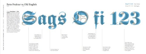
What a brilliant idea for a book about typography. And, at first glance, how brilliantly designed and executed.Arranged in alphabetical order I decided to read about one font a day. Yet I've only got as far as Bembo and I almost want to throw this book across the room. For a typeface (Archer) that's suddenly come into fashion, the authors appear to be too lazy to look beyond examples from a just single brand, to which they devote no fewer than three photographs and all of them displaying upper case. Yet when they describe the font's distinguishing features on the opposite page they spend most of the paragraph talking about the various lower-case letters. Inexcusable.Three pages further on, and here's Bembo: "double-storey lower-case 'a'", it says. I wonder what that looks like, it having been pointed out specifically. But for a typeface that's been around since 1495 you'd think that their photographer might have been able to find a lower-case word somewhere as an example (or for the book's editor to have insisted on one.) But oh no: one single photograph of the National Gallery signage, and of course it's all in upper-case.Now I dread turning the remaining 372 pages (that's half a year!) What a shame. This is otherwise a superbly-conceived book, making the study of typography interesting and accessible to all. If my disappointment seems out of proportion it's because an opportunity has been missed (through rushing? carelessness?) to make this a definitive reference. Someone needs to get to work on the second edition pronto and then we'll have something approaching the perfect book.
M**A
they loved
Bought as present, they loved it
D**N
It's a great introduction to typography.
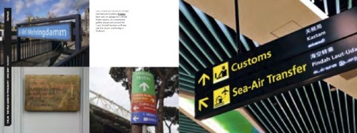
I thought I'd write this review to offset the other one.As mentioned in the other review, sometimes the photographs lack the letters that are being talked about, true. I did find the real world examples very helpful. You do get a good idea of where the fonts should be used. One or two of the photos were blurry (I say this because I am a photographer). You know, but people shouldn't complain so much. Honestly. What do you expect for this price???Maybe in another edition, I would like to see an A to Z along the top of both pages showing the entire typeface. Perhaps that is an old way of doing it, I don't know.I do think that a lot of effort was put into this book. It's very easy to pick up and start reading which is important in today's world. I'll be keeping this book for future reference. I have already learned much. I am reading about 3 fonts per day.
J**S
Five Stars
Great real cases to studie and evaluate, nothing better than see good work on the street
ترست بايلوت
منذ أسبوع
منذ يومين